Let the surroundings make the frame
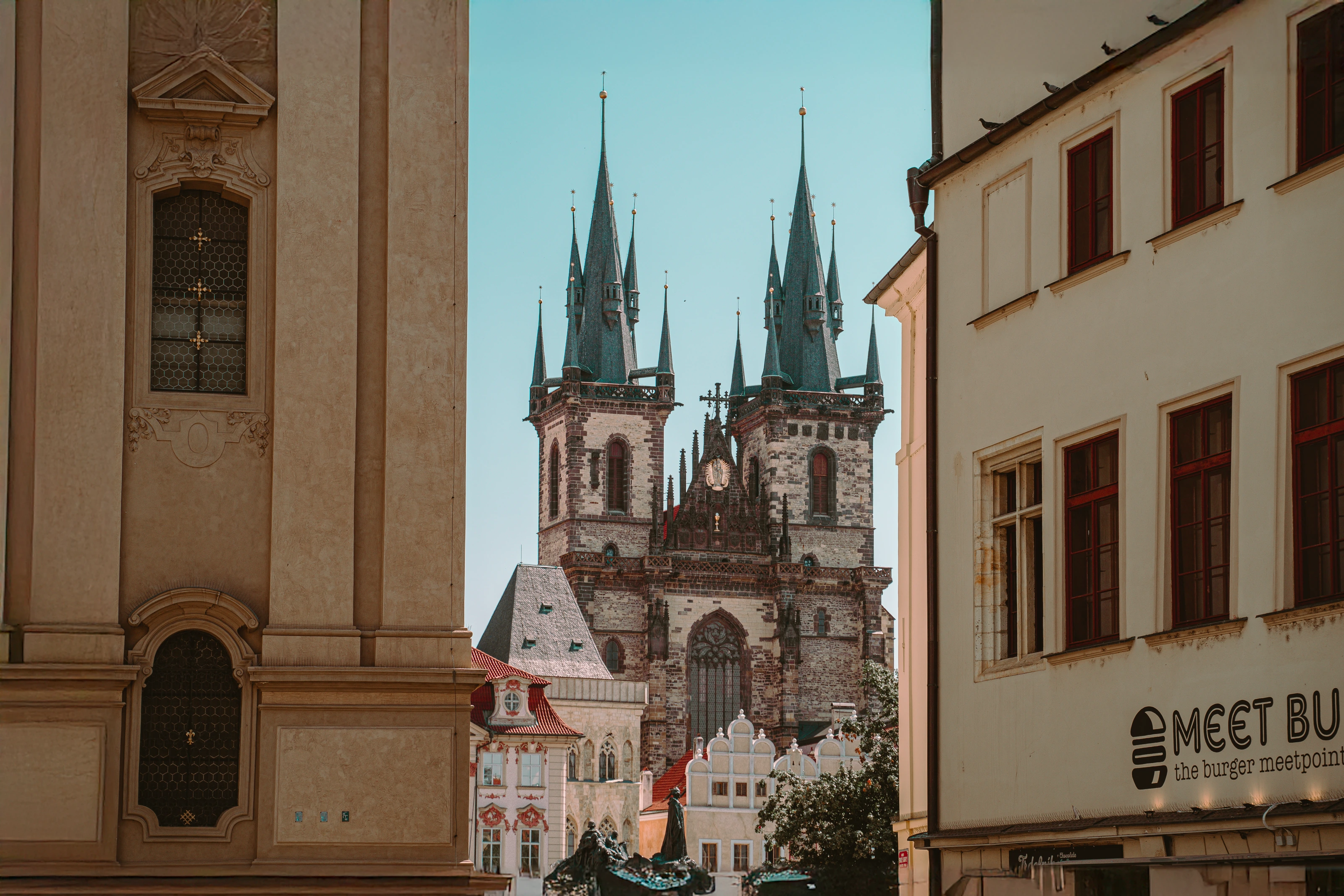
The pale building on the left occupies a broad part of the photograph. On the right, a row of windows and a sloping roof create a different boundary. Together they direct attention towards the spires without forming a perfectly symmetrical border. That slight imbalance makes the scene feel like a view discovered within a street.
When you try this yourself, look beyond the main building. A nearby wall, archway or gap can organise the view. Move a little in either direction and watch what becomes visible. The strongest position may be the one that gives your subject the clearest outline.
Give the tallest details some breathing room
The small points at the tops of the towers have open sky around them. This separation helps their shapes remain readable, while the lower part of the scene is much more densely packed with roofs, stonework and other details.
Before pressing the shutter, follow the outline of your subject. Check whether a roof edge crosses an important detail or whether a tip is almost touching the edge of the picture. A small change in viewpoint can make those relationships feel more intentional.
Use layers to describe the distance
The large foreground walls establish the nearest layer. Smaller rooftops and the street details sit beyond them, while the towers rise farther back. Their different sizes help a flat photograph suggest depth without relying on a person standing beside the subject for scale.
Look at the whole image before zooming in on individual details. If the foreground hides everything you wanted to show, it is doing too much. If it gives the eye a route towards the subject, it has earned its place.
Notice what the colours are doing
Warm cream and brown surfaces surround a cool, blue-green patch of sky. The dark towers stand between those colours, and the smaller red roof details add another point of interest lower down. The colour relationships support the structure of the picture.
When editing a scene like this, compare changes at the size you expect people to view it. Keep enough variation in the stone and sky for each area to have its own character. Increasing every colour equally can make it harder to see which part deserves attention first.
Decide how much everyday life to include
The shop sign near the bottom right places the ornate architecture beside an ordinary street detail. Leaving that contrast visible gives the photograph a different character from a tight study of the towers alone. Both approaches can work; they tell different stories about the same view.
Try a second composition that concentrates on the building, then compare it with the wider scene. Ask which photograph better expresses what interested you. A cleaner frame is useful when it strengthens the idea, but an everyday detail can be part of the reason a picture feels connected to a place.
Try one subject, three arrangements
Choose one architectural subject and make three considered photographs: an open view, a view framed by its surroundings, and a closer detail. Keep the main subject clear in each. Reviewing them together is a simple way to see how your position changes the photograph, even when the building itself stays exactly the same.