Start with the direction of the light
Look for light that describes shape: a face lit from one side, sunlight crossing a doorway or a figure separated from a darker background. Strong light is not the only option. Soft light can reveal fine texture and gentle transitions that also work well without colour.
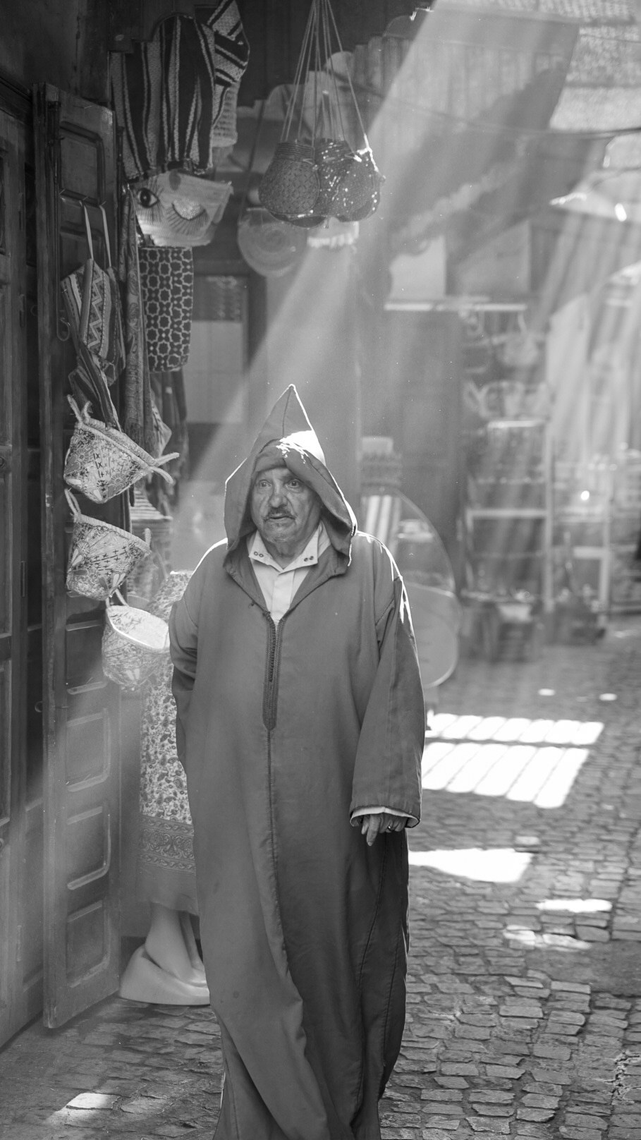
In the portrait above, the bright shafts of light and darker clothing create distinct areas to look through. The bags, wall and paving add context around the person. Notice how much of that structure would remain even if you could not name a single colour in the original scene.
Separate subjects by tone
Two very different colours can become similar shades of grey. A subject that stands out clearly in colour may merge into the background after conversion. Change your viewpoint or wait for the subject to move into a lighter or darker area instead of relying entirely on editing later.
If your camera offers a monochrome preview, use it as a seeing exercise. When shooting RAW, the underlying colour data is generally retained, although the preview and the way editing software initially displays it can vary. A monochrome JPEG is different: keep a colour or RAW original if you want the freedom to revisit the decision.
Keep the composition purposeful
Scan for bright distractions near the edges of the frame. Without colour to guide attention, a small bright sign or empty patch of sky can become unexpectedly dominant. Move, reframe or include it deliberately; do not assume a black-and-white conversion will make it disappear.
Give the main subject enough space to be understood. A close crop may emphasise expression, while a wider or taller frame can explain the surroundings. In a street portrait, ask whether the architecture, objects and light add information before removing them. Photograph people considerately and respect anyone who does not want to take part.
Edit the tones before adding drama
Begin with exposure and the overall balance between highlights, midtones and shadows. Then adjust the black-and-white colour mix if your editor provides one. Moving a colour channel changes the brightness of areas that originally contained that colour, which can help separate a face, clothing or background.
Make small changes and compare them with the starting point. Excessive contrast can close down shadow detail, while strong clarity can make skin and fine edges look harsh. Deep blacks and pure whites are creative choices, not requirements for every monochrome photograph.
Try a simple exercise
Photograph one scene in three ways: a wide view that explains the setting, a middle-distance view that makes the subject clear, and a detail that concentrates on texture or gesture. Keep the light similar so you can compare what the framing changes.
Convert the three frames and look at them at the size you will actually share or print. Choose the one with the clearest visual idea. If the colour version communicates that idea better, keep it in colour. The purpose is to make a more deliberate photograph, not to turn every image into the same style.